
There are at least five different editions of genuine David Roberts Lithographs printed before 1900. In addition, there are hundreds of later reprints and reproductions, some authorized and some not. The marketplace abounds with these prints, the vast majority of which are at best the later, inferior genuine editions, and at worst reproductions being sold as genuine first editions. It is therefore of extreme importance to know how to tell the various editions and reproductions apart.
There are four, and only four, genuine first editions of the David Roberts Lithographs - all published by F.G. Moon in London between 1842 and 1849. They are the colored Royal Subscription Edition Folio prints (sometimes called "RSE" prints), the Standard Edition Folio prints (sometimes called "SE" prints), and proof editions (uncommonly seen) of each of these two formats. (See "Publication of the Prints") NOTHING ELSE IS A GENUINE DAVID ROBERTS FIRST EDITION LITHOGRAPH. Knowing how to distinguish these genuine first editions from others in the marketplace is very important, since first editions are more valuable than later editions by at least a factor of ten.
 Fortunately,
there are distinct identifying marks which usually make it easy to tell the
first edition lithographs from later genuine editions and from reproductions
and fakes. There are, however, reproductions being intentionally sold as first
editions which are more difficult to spot.
Fortunately,
there are distinct identifying marks which usually make it easy to tell the
first edition lithographs from later genuine editions and from reproductions
and fakes. There are, however, reproductions being intentionally sold as first
editions which are more difficult to spot.
The first determining factor is the size of the images, which for genuine first editions fall within a particular range. The image sizes for all editions are identical, as they were all printed from the same lithographic stones - about 13" x 20" for full page images and 10" x 13" for half page images. The exact size for each image varies within a maximum of an inch in either dimension from image to image. The principal differences between the four editions are in their paper, mounting, the presence or absence of printed titles, and the addition of original hand coloring.
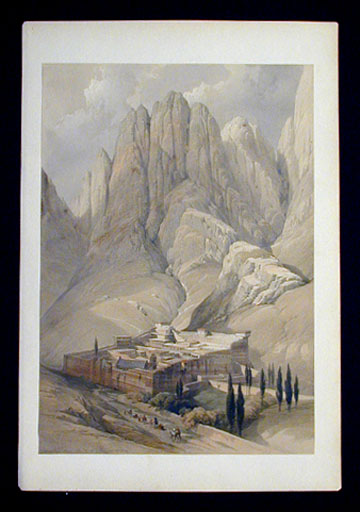
The RSE lithographs were printed on thin "India" paper, and (except for the proof versions) were then hand colored. (See "Original and Modern Hand Coloring") The colored and proof RSE prints were then trimmed to the image and glued along their edges onto plain white card, with the centers of the images left unattached. Because the proof version of the RSE prints is so seldom seen, from this point forward only the colored version will be referred to. At right is an RSE print of Convent of St. Catherine [with Mount Horeb], showing the mounting card.
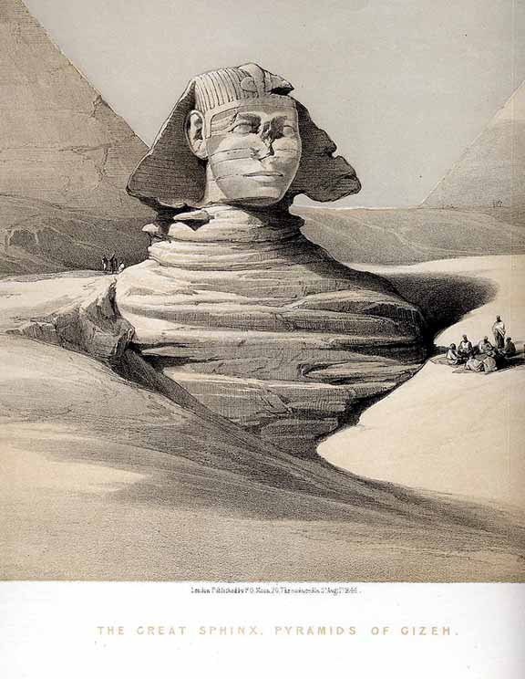
The SE lithographs were printed on a heavier matte paper. They were not originally hand colored and were not trimmed to the image. Instead, a small publisher's mark was printed just below the center of the image, and beneath that a block letter title appears. Below, for example, is the center portion of an SE print of The Great Sphinx, Pyramids of Gizeh showing the bottom margin and the printing below the image. The SE proof edition omits the block letter title, and sometimes the the publisher's mark as well. Again, because the proof version of the SE prints is so seldom seen, from this point forward only the standard SE version will be referred to.
Titles and Signatures in the Image
Most nineteenth century limited edition prints were not signed and numbered in the way that is done today. Instead, a facsimile of the artist's signature and a title for the image were frequently worked into the image. Sometimes the artist signed directly on the black or gray stone after the lithographer had completed it, and sometimes the signature was placed there by the lithographer. This is the case for both the RSE and SE editions - Roberts' signature appears in varying loctions within the lower area of each printed image (save a very few such as Suez, from the Holy Land series.) A title for the print, and usually the 1838-39 date of the original sketch, are also worked into the lower area of the image. Additionally, the signature of Louis Haghe, the lithographer appears in many of the prints as "L. Haghe, lith." - infrequently in the earlier Holy Land prints, and in virtually all of the later Egypt & Nubia prints. One would like to think that this changing pattern is due to Roberts' increasing respect for Haghe's work as the project progressed. In the later prints the signatures appear together and are of equal size.(See the following page for examples.)

![]()
![]()